forked from mirrors/keywind
Fork of Keywind for amethyst's Keycloak instance.
|
|
||
|---|---|---|
| META-INF | ||
| src | ||
| theme/keywind/login | ||
| .editorconfig | ||
| .gitignore | ||
| .prettierrc | ||
| LICENSE | ||
| package.json | ||
| pnpm-lock.yaml | ||
| postcss.config.js | ||
| preview.png | ||
| README.md | ||
| tailwind.config.js | ||
| tsconfig.json | ||
| tsconfig.node.json | ||
| vite.config.ts | ||
🌬️ Keywind
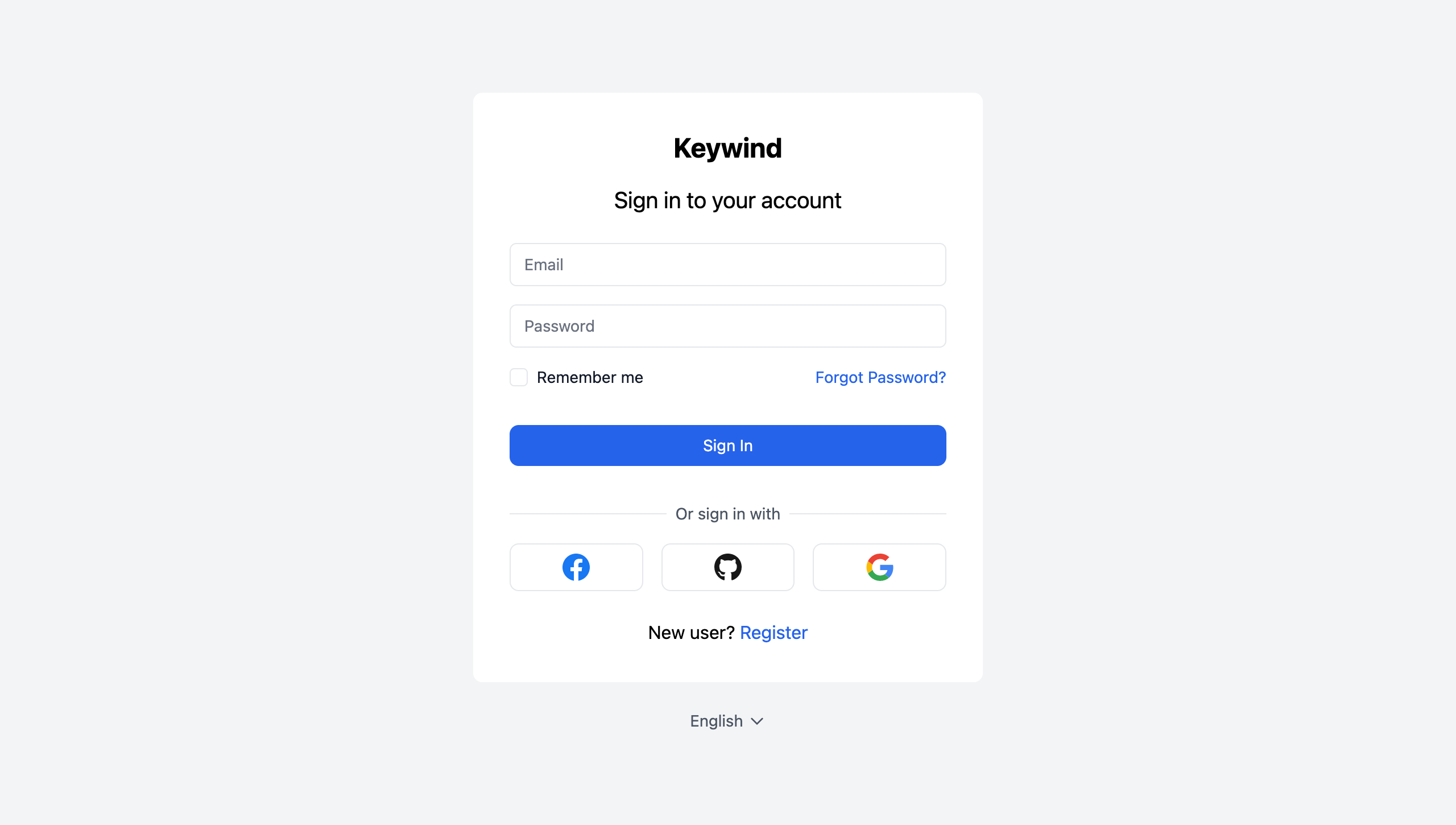
Keywind is a component-based Keycloak Login Theme built with Tailwind CSS and Alpine.js.
Styled Pages
- Login
- Login Config TOTP
- Login IDP Link Confirm
- Login OAuth Grant
- Login OTP
- Login Reset Password
- Login Update Password
- Login Update Profile
- Logout Confirm
- Register
Identity Provider Icons
- Bitbucket
- GitHub
- GitLab
- Microsoft
- OpenID
- Red Hat OpenShift
- PayPal
- Stack Overflow
Installation
Keywind has been designed with component-based architecture from the start, and you can customize as little or as much Keywind as you need:
- Deploy Keywind Login Theme
- Create your own Login Theme
- Specify parent theme in theme properties:
parent=keywind
- Brand and customize components with FreeMaker
Customization
Theme
When you do need to customize a palette, you can configure your colors under the colors key in the theme section of tailwind.config.js file:
// tailwind.config.js
module.exports = {
  theme: {
    extend: {
      colors: {
        primary: colors.red,
      },
    },
  },
};
Read more about Tailwind CSS configuration in the documentation.
Components
You can inherit Keywind components in your own theme. For example, to resize the primary button you should create a styled theme/mytheme/components/button/primary.ftl file:
<#macro kw component="button" rest...>
  <${component}
    class="bg-primary-600 flex justify-center px-6 py-3 relative rounded-lg text-md text-white w-full focus:outline-none focus:ring-2 focus:ring-primary-600 focus:ring-offset-2 hover:bg-primary-700"
    <#list rest as attrName, attrValue>
      ${attrName}="${attrValue}"
    </#list>
  >
    <#nested>
  </${component}>
</#macro>
Build
When you're ready to deploy your own theme, run the build command to generate a static production build.
pnpm install
pnpm build
