mirror of
https://github.com/lukin/keywind.git
synced 2025-01-10 09:56:25 +00:00
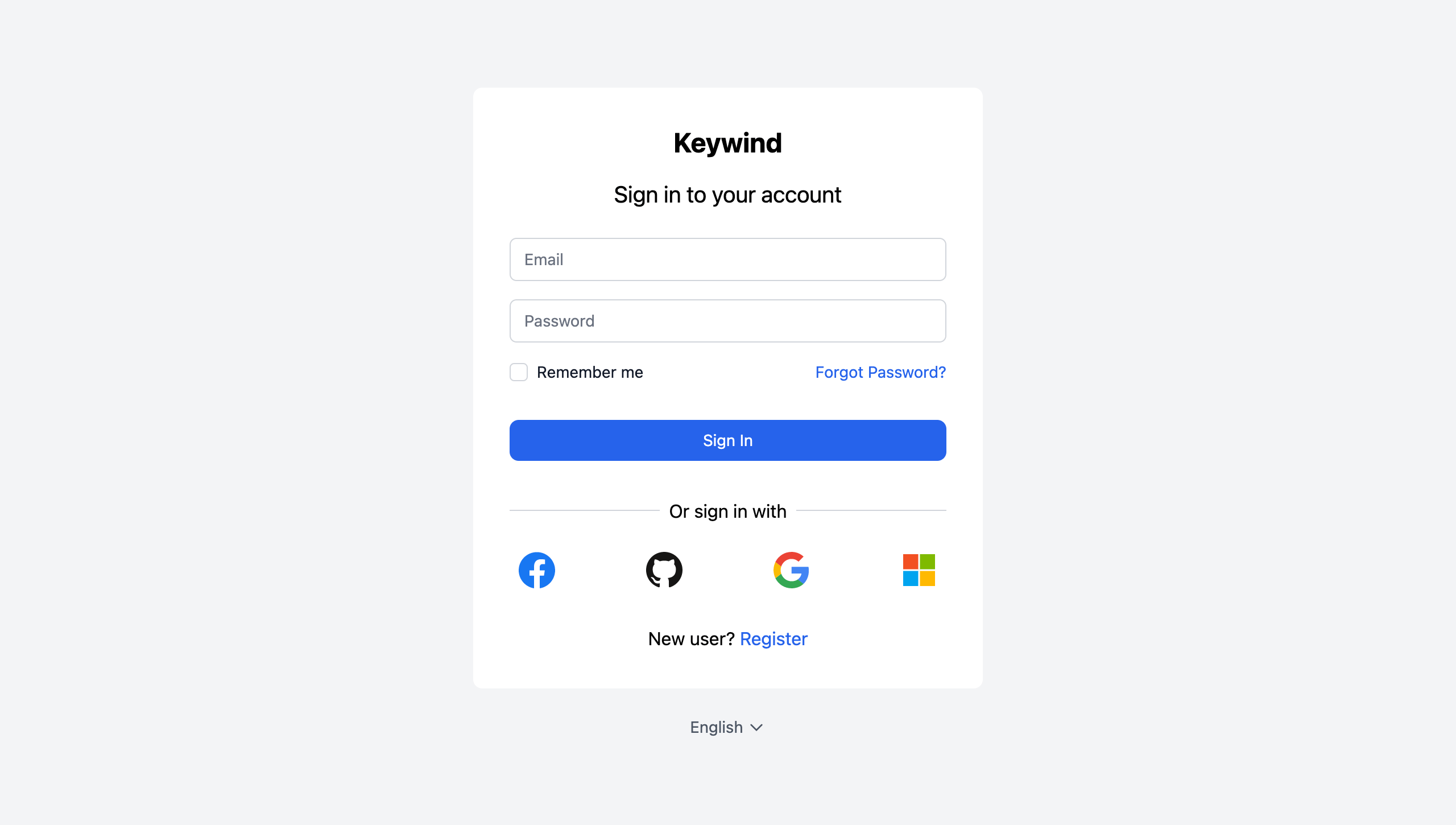
Keywind is a component-based Keycloak Login Theme built with Tailwind CSS
| META-INF | ||
| src | ||
| theme/keywind/login | ||
| .editorconfig | ||
| .gitignore | ||
| .prettierrc | ||
| LICENSE | ||
| package.json | ||
| postcss.config.js | ||
| preview.png | ||
| README.md | ||
| snowpack.config.js | ||
| tailwind.config.js | ||
| yarn.lock | ||
🌬️ Keywind
Keywind is a component-based Keycloak Login Theme built with Tailwind CSS and Alpine.js.
Installation
Keywind has been designed with component-based architecture from the start, and you can customize as little or as much Keywind as you need:
- Deploy Keywind Login Theme
- Create your own Login Theme
- Specify parent theme in theme properties:
parent=keywind
- Brand and Customize components with FreeMaker
Features
Styled Pages
- Login
- Password Reset
- Register
Examples
Color Theme
When you do need to customize a palette, you can configure your colors under the colors key in the theme section of tailwind.config.js file:
// tailwind.config.js
module.exports = {
  theme: {
    extend: {
      colors: {
        primary: colors.red,
      },
    },
  },
}
Read more about Tailwind CSS configuration in the documentation.
Primary Button Size
You can inherit Keywind components in your own theme. For example, to resize the primary button you should create a styled theme/mytheme/components/button/primary.ftl file:
<#macro kw component="button" rest...>
  <${component}
    class="bg-primary-600 flex justify-center px-6 py-3 relative rounded-lg text-md text-white w-full focus:outline-none focus:ring-2 focus:ring-primary-600 focus:ring-offset-2 hover:bg-primary-700"
    <#list rest as attrName, attrValue>
      ${attrName}="${attrValue}"
    </#list>
  >
    <#nested>
  </${component}>
</#macro>
Build
When you're ready to deploy your own theme, run the build command to generate a static production build.
yarn build
