|
|
||
|---|---|---|
| html/login | ||
| META-INF | ||
| scripts | ||
| src | ||
| theme/keywind/login | ||
| .editorconfig | ||
| .gitignore | ||
| .prettierrc | ||
| LICENSE | ||
| package.json | ||
| pnpm-lock.yaml | ||
| pom.xml | ||
| postcss.config.js | ||
| preview.png | ||
| README.md | ||
| tailwind.config.ts | ||
| tsconfig.json | ||
| tsconfig.node.json | ||
| vite.config.ts | ||
🌬️ Keywind
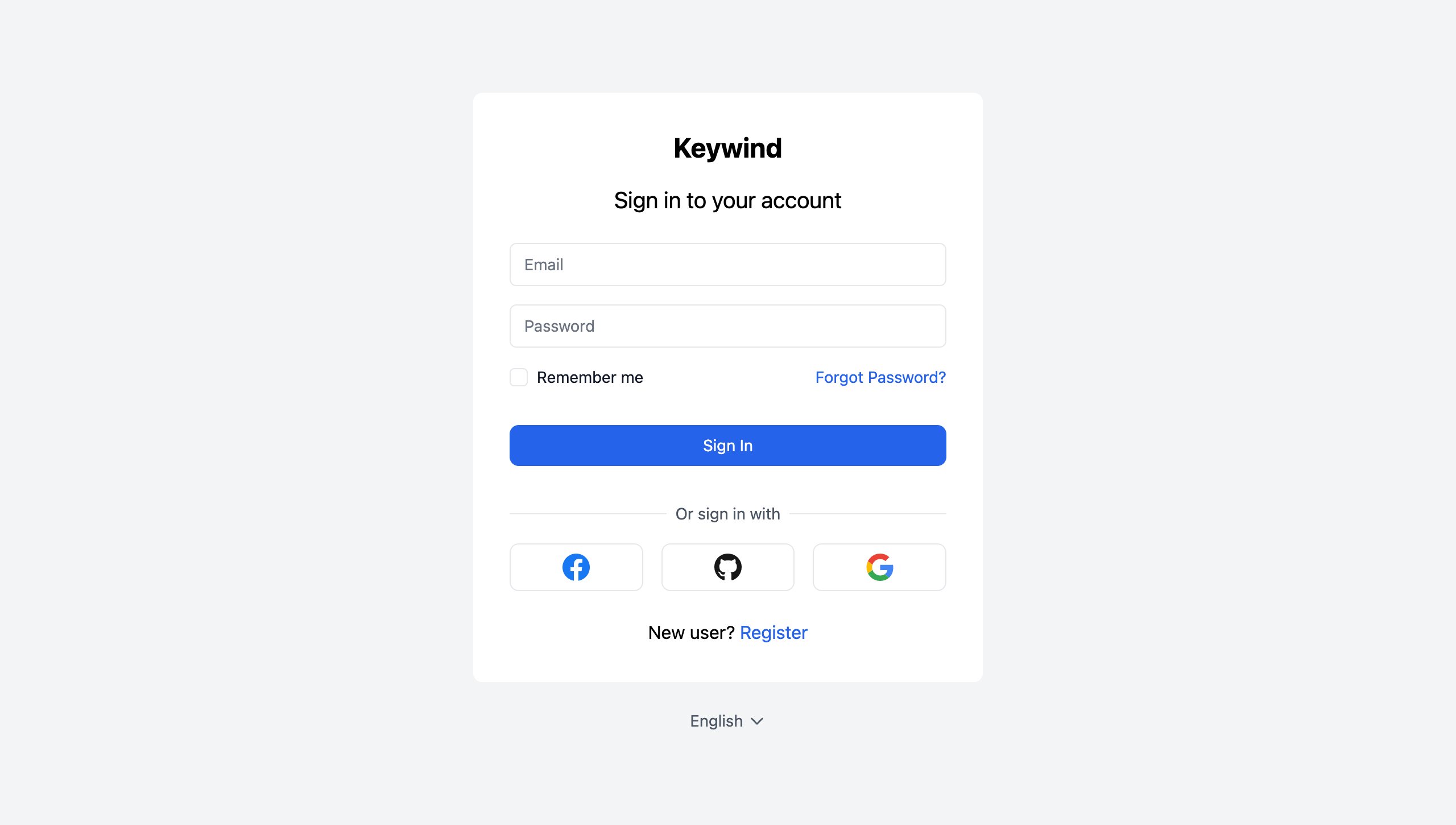
Keywind is a component-based Keycloak Login Theme built with Tailwind CSS and Alpine.js.
Styled Pages
- Error
- Login
- Login Config TOTP
- Login IDP Link Confirm
- Login OAuth Grant
- Login OTP
- Login Page Expired
- Login Password
- Login Recovery Authn Code Config
- Login Recovery Authn Code Input
- Login Reset Password
- Login Update Password
- Login Update Profile
- Login Username
- Login X.509 Info
- Logout Confirm
- Register
- Select Authenticator
- Terms and Conditions
- WebAuthn Authenticate
- WebAuthn Error
- WebAuthn Register
Identity Provider Icons
- Apple
- Bitbucket
- Discord
- GitHub
- GitLab
- Microsoft
- OpenID
- Red Hat OpenShift
- PayPal
- Slack
- Stack Overflow
Installation
Keywind has been designed with component-based architecture from the start, and you can customize as little or as much Keywind as you need:
- Deploy Keywind Login Theme
- Create your own Login Theme
- Specify parent theme in theme properties:
parent=keywind
- Brand and customize components with FreeMarker
Customization
Theme
When you do need to customize a palette, you can configure your colors under the colors key in the theme section of Tailwind config file:
tailwind.config.js
module.exports = {
  theme: {
    extend: {
      colors: {
        primary: colors.red,
      },
    },
  },
};
Read more about Tailwind CSS configuration in the documentation.
Components
You can update Keywind components in your own child theme. For example, create a copy of the body component and change the background:
theme/mytheme/login/components/atoms/body.ftl
<#macro kw>
  <body class="bg-primary-100">
    <#nested>
  </body>
</#macro>
Build
When you're ready to deploy your own theme, run the build command to generate a static production build.
pnpm install
pnpm build
To deploy a theme as an archive, create a JAR archive with the theme resources.
pnpm build:jar
